Brand Guide
The visual and editorial system behind the Commonway System (CS): how it looks, how it's written, and how its evidence is presented. This page transcribes the working brand reference; treat the color values and rules below as the source of truth over anything in the publication's theme.
#Voice attributes
| CS voice is... | CS voice is not... |
|---|---|
| Encyclopedic | Conversational or chatty |
| Evidence-led (claims trace to citations) | Opinion-led or persuasive |
| Layered (plain language first, technical depth beneath) | Dumbed-down, or gatekept behind jargon |
| Precise (specific numbers, named sources) | Vague or hand-wavy |
| Confident through sourcing | Confident through authority or credential-claiming |
| Neutral and descriptive | Salesy, urgent, or marketing-toned |
| Inclusive of total beginners | Exclusionary of experts who already know the material |
#The disagreement-phrasing pattern
Every place CS takes a position against, or beyond, conventional practice uses the same underlying shape: name the origin (an intentional baseline practice, or an emergent structural pattern), then close with a classification backed by specific evidence. A baseline source is never called "wrong," "outdated," or "flawed."
- Opening A (intentional practice): "[Baseline source] recommends/practices [X]."
- Opening B (emergent/structural): "[Pattern] emerges when [structural cause]."
- Closer, always: "CS classifies this as [Default / Situational-Discouraged / Avoid], informed by [specific evidence source and finding]."
#Editorial standards
Sentence-level production rules, distinct from the voice attributes above.
- Word-lite principle. Say as little as possible while conveying as much meaning and nuance as possible. Every sentence gets tested for whether it can be shorter without losing precision.
- Layered sentence complexity. Plain-language passages use short, direct sentences with common words. Technical-layer passages, sitting just beneath, can carry longer sentences with precise technical terms and multiple citation badges. The two layers never mix mid-paragraph.
Caution
No em-dashes, ever, anywhere in CS content. This is a standing, non-negotiable rule. Use a comma for a brief interruption, a period to split into two sentences, a semicolon to connect related independent clauses, parentheses for a true aside, or a colon to introduce an explanation or list.
- Plain-language-first terminology. The first time a technical term appears in a plain-language passage, it's introduced in accessible language before the formal term is used, not the reverse.
#Color system
#Base tokens
Caution
Amber is reserved exclusively for the unsourced-claim flag and pattern-illustration highlighting. It never appears anywhere else in the system.
#Evidence tiers (one hue, three depths)
Represents a strength gradient, not unrelated categories. Legal requirement is the strongest backing, precedent the weakest, so tiers separate by lightness and remain readable to red-green color blindness.
As rendered chips:
#Density tiers
The Commonway System design encodes density within each Scale Hierarchy and Functional Classification's own 6-step ramp, not as a separate overlay. DensityChip deviates from that on purpose: pattern pages need to show "typical at" density tiers independent of any one classification (a card in the Pattern Index has no classification color context of its own until the page around it supplies one), so it uses its own independent neutral-tan ramp instead, lightest at Undeveloped and darkest at Core, deliberately distinct from both the amber accent and every classification color so it never gets confused with either system.
As rendered chips:
#Scale ramps
Every Scale prefix in the Pattern ID scheme gets its own 6-step tint/shade ramp across density tiers, lightest at Undeveloped, darkest at Core: nine ramps in total, one per prefix (Network, Corridor, Local, Collector, Arterial, Freeway, Intersections & Crossings, Facility, Element). The hues are placed in spectrum order matching Scale sequence (Network=red through Element=violet), chosen by simulating protanopia, deuteranopia, and tritanopia across candidate layouts and maximizing worst-case separation, then hand-adjusted for wider Local/Collector/Arterial separation specifically. The ramp color itself is aesthetic and for fast wayfinding, not the mechanism that makes classification colorblind-safe — a text label next to every colored element is what does that. Never color alone.
Network
Corridor
Local
Collector
Arterial
Freeway
Intersections & Crossings
Facility
Element
#Color symbols
An optional reading aid, switched on from the Display settings panel (Color symbols). A small cream tab with near-black symbols appears in the bottom-left corner of the colored image area on Pattern and Retrofit index cards, and on the bottom-left of the Pattern ID and Retrofit ID cards, so a reader who cannot tell two hues apart can still tell them apart. The symbols come from ColorSym(opens in new tab), a free color-identification system by Chris Eastridge and Luis Francisco (symbols under CC BY-SA 4.0(opens in new tab), used here unmodified). ColorSym has three primary symbols (red is a dot, yellow is a line, blue is a chevron), and its combined colors join their parents.
ColorSym has no symbol for yellow-green, teal, or magenta, and four of this publication's hues fall between its colors. Those are drawn as two symbols joined by a slash, dominant hue first. This is an extra affordance for people who can use it, not the way classification is communicated: every colored element already carries a text label. The tab is decorative (hidden from screen readers), fixed cream and near-black in both themes so it clears contrast over any card color, and scales with text size.
| Scale or classification | Color | Symbol | Reads as |
|---|---|---|---|
| Network | Red | Dot | |
| Corridor | Yellow | Line | |
| Local street | Yellow leaning green | Line, then green (line and chevron together) | |
| Collector street | Green | Green (line and chevron together) | |
| Arterial street | Green leaning blue | Green, then chevron | |
| Freeway | Blue leaning green | Chevron, then green | |
| Intersections and crossings | Blue | Chevron | |
| Facility | Violet | Violet (dot and chevron together) | |
| Element | Violet leaning red | Violet, then dot |
#Typography
Fraunces (variable serif) for headings, Inter (variable sans) for body text. Both free, open-source, true variable fonts that hold up in print and web. Fraunces carries warmth and distinctiveness at display size; Inter stays clean and legible through dense technical passages.
#Illustration & photography
Clean flat vector illustration, NACTO-inspired, warmed by human figures at true scale. Spot-color amber technique: context stays grayscale, the specific pattern being illustrated floods amber.
The amber trigger rule. Only the specific pattern a page is about floods amber. Adjacent patterns appearing in the same illustration for context stay grayscale, even if they're themselves named CS Typologies with their own pages elsewhere. One page, one amber subject, no exceptions. The amber-flooded pattern occupies roughly 60 to 70 percent of the frame, with just enough grayscale context to make the relationship legible.
Human figures. Render in a fixed, neutral ink-based treatment regardless of what's flooding amber around them, since their job is scale and presence, not representing the pattern. Cap at 2 to 3 figures per illustration. Across the publication as a whole, figures should reflect a real range of ages and mobility.
Sizing and aspect ratio by scale
| Scale level | Format |
|---|---|
| Network / Corridor | Wide format (16:9 or wider) |
| Segment | Cross-section format (about 2.8:1)) |
| Intersection | Near-square or 4:3,, plan-view |
| Facility / Element | Smaller square detail insets |
Photography is reserved for case-study and precedent documentation only (before/after material for a real corridor), never for core pattern definitions, which stay flat vector illustration.
#Components
#Pattern ID card
ART-UMS-09 Urban main street
The colored left edge always matches the pattern's Scale/classification, using that ramp's own representative color from tokens.css: whichever tier is lightest while still clearing (or getting closest to) the 3:1 UI-component contrast minimum, which differs by hue (Core for Corridor, Local, Collector, Arterial, and Freeway; Compact for Intersections & Crossings and Facility; Urban for Network and Element). The ID text itself is always ink, per the guide: "a constant identity mark distinct from classification color."
#Pattern Index card

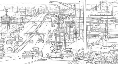
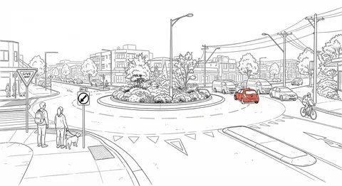
Used on the Pattern Index (/patterns/) in place of a plain bulleted list, one card per Street Typology. The image area recolors per classification with a mix-blend-mode: color overlay (Suburban tier at rest, Core tier as the hover border, for every one of the nine Scale ramps). Most patterns still use a single shared placeholder graphic; a handful have a real illustration in already, and swapping the rest in over time only means setting image: in that pattern page's own frontmatter (the card looks it up itself), and the recolor mechanism keeps working unchanged either way. The number circle restarts at 1 for each Functional Classification group and is always ink-fixed/paper-fixed regardless of theme, the same "constant identity mark" reasoning as the Pattern ID text. The status badge only appears for Situational and Avoid; Recommended (the unremarkable default) gets no badge here at all, unlike its quiet pill on the full pattern page.
#Retrofit Strategy card
RFT-CDR-01 CorridorFour-to-three lane road diet
RFT-INT-02 IntersectionMedian U-Turn (MUT) retrofit
Same visual language as the Pattern ID card above, minus the status badge: a Retrofit Strategy is never Recommended, Situational, or Avoid, it's either applicable to a given street or it isn't, and that judgment lives in each entry's own Applicability and thresholds section rather than a badge. In place of a Functional Classification, the right-aligned label shows the strategy's Scale (Corridor, Intersection, or Network, matching the RFT-SCALE-## ID's own middle segment), and the left edge color follows whichever Pattern classification is that scale's functional peer rather than an invented Retrofit-only palette: Intersection strategies use the real Intersections & Crossings ramp, Corridor and Network strategies use Patterns' own real corridor/network ramps, now that all nine Scale prefixes have one (see the Scale ramps above). The ID text is always ink, same "constant identity mark" reasoning as the Pattern ID card.
#Retrofit Strategy Index card
Used on the Retrofit Strategy Index (/retrofits/), the same card-grid treatment the Pattern Index card gets above, right down to reusing the same .pattern-index-grid layout utility and the same shared placeholder graphic (no Retrofit Strategy has a real illustration yet). No status badge appears here either, for the same reason as the card above. The number circle restarts at 1 within each scale group, following the RFT-SCALE-## numbering directly, the same "no separate counter prop needed" mechanism the Pattern Index card uses.
#Citation badge
#Unsourced-claim flag
#Speed & Modal Hierarchy card
Design speed & speed limit
Modal hierarchy
Design speed & speed limit
Modal hierarchy
Every Local, Collector, and Arterial pattern that allows automobiles carries this card, split into Section A (Design Speed & Speed Limit) and Section B (Modal Hierarchy). Section A shows one MUTCD-style speed-limit sign per applicable speed, paired with a line stating whether the pattern inherits its Character Type's rule as written or carries a documented override, and a link to Design Speed & Speed Limits. Section B shows a row of Modal Hierarchy pills, described in its own entry below.
Five named layout variations:
- Local / Collector. Signs and description run side by side, as in the first example above.
- Arterial. Signs stack above the description instead, as in the second example above, needed once a pattern can carry more than two signs at once (up to five, one per density tier).
- Speed-only (Stroad). Section A's signs with no Section B pill row at all, since Stroad is an explicit Avoid pattern with no ranked hierarchy to show.
- Modal-Hierarchy-only (patterns that exclude automobiles entirely, Shared-Use Path and Bike Highway / Greenway among them). Section B with no Section A at all, since Design Speed & Speed Limits has nothing to say about a street with no cars on it.
- Time-conditional (Festival Street, School Street). Two labeled pill rows inside one Section B, since each pattern's modal hierarchy changes by time of day.
#Modal hierarchy pills
A reusable component in its own right, not just a piece of the card above. Each pill pairs a small icon with the mode's name, one pill per mode across five modes: Pedestrian, Bicycle, Transit, Vehicle, and Freight.
Background color is the pattern's own Functional Classification color, the same token the Pattern ID card's left edge uses above, not a fixed "Core tier" value: it's whichever tier of that classification's ramp the publication's --cw-local/--cw-collector/--cw-arterial tokens already point to (see the Pattern ID card entry above and tokens.css's own comments), which differs by classification and shifts again between light and dark mode. Text and icon color is whichever of #FFFFFF or #000000 clears contrast against that background by the larger margin, computed per classification and per theme rather than fixed to one value across all three, with one documented exception for Arterial; see Accessibility notes below.
Two pills separated by a ">" means the left one strictly outranks the right, the first example row above. Two pills separated by an "=" means they're explicitly tied at the same rank, the second example row above, a real case on Shared-Use Path and Multi-Use Trail / Greenway, where Pedestrian and Bicycle share top priority with no ranking between them.
#Guide diagram
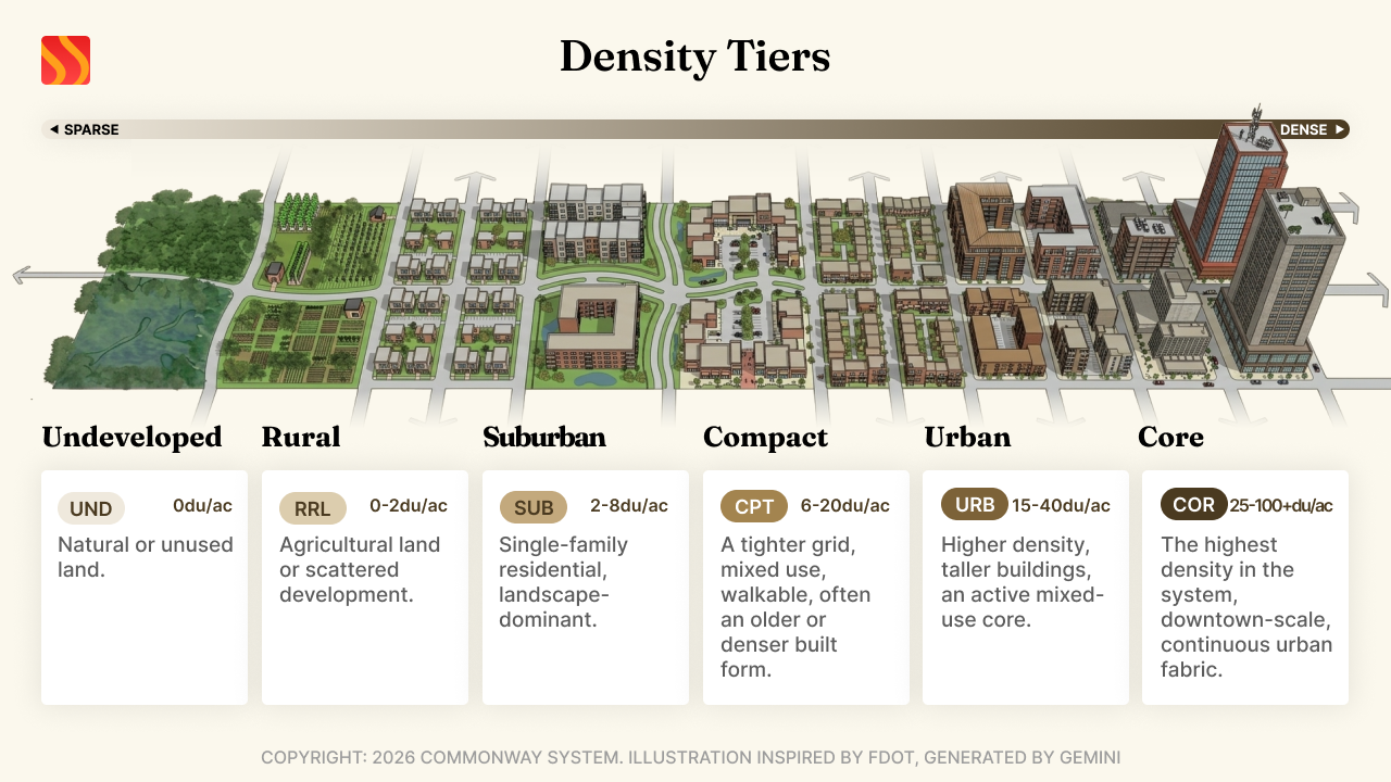
Used for the full-width topic diagrams on Foundations guide pages (currently Density Tiers, Design Speed & Speed Limits, Scale Hierarchy, and Street Types & Classifications), one per page, placed as the first element right after the page's own <script> block. Same rounded-corner/hairline-border/shadow treatment as any other standalone content image on the publication, reproduced in this component's own styles for the captioned case above, since the image is no longer a direct child of the page's content column once it's wrapped for a caption.
Four props beyond the required src/alt, all optional and independent of each other. width/height set the image's real pixel dimensions as HTML attributes, not just CSS, so the browser can reserve the correct layout space before a lazy-loaded image actually finishes downloading, instead of leaving a gap or reflowing the page once it lands. aspectRatio is a fallback for when only the ratio is known, not the exact pixel size. caption adds a line of visible text under the image, shown above, inside a real <figure>/<figcaption> pair, semantics an assistive technology already understands with no extra ARIA needed. Caption is deliberately kept distinct from alt text: alt describes what the image shows, for someone who can't see it; caption is visible context or attribution for everyone, the generation credit in the example above rather than a restatement of the image's content. Every diagram lazy-loads (loading="lazy") regardless of which of these props are set, so a diagram below the fold costs nothing until a reader actually scrolls to it. Omit all four optional props for a bare, unsized <img>, the same shape these diagrams originally shipped with before width/height/caption support existed.
#Buttons, links & forms
The interactive-site build needs these regardless of how sparingly the publication itself uses them, since search, filtering, and the eventual interactive Guide diagnostic tool all depend on real form controls. The publication does not have production <button>/<select> styling wired up as reusable components yet, but these previews use the same tokens.css values everything else on the publication does.
#Buttons
Primary uses the signature teal fill with ink text, not paper text. Paper-on-teal only reaches 2.86:1 contrast and fails; ink-on-teal reaches 6.18:1.. At most one primary button per view; everything else is secondary or dark.
#Hyperlinks
Links use indigo, not teal, since teal is already committed to citations and evidence tiers. Underlined always, not just on hover, since this is a reference work first and a marketing publication second. This example uses the publication's real --cw-link token, which reflects both modes correctly.
The working draft's original indigo (#3D3AAB) reaches 8.28:1 contrast on light paper, but only 2.1:1 on a dark background, well below the 4.5:1 WCAG AA minimum. The dark-mode value is the same indigo/violet hue lightened, not a different color, and reaches 7.89:1 on dark paper. Dark mode isn't part of the original working draft; this pairing is a publication-only addition, documented here since it's now the real token every hyperlink in the guidebook uses.
#Form controls
Focus state on text inputs and selects uses a teal outline ring, not a color change on the border alone, so keyboard navigation stays visible against every classification color context.
#Citation format
The house citation format is modeled on agency-reference conventions: source name, year, title, publisher (when distinct from the source), and URL. Entries are numbered to match their inline badges, sorted by publication date, and, within a single source cited multiple times, ordered by where the content appears in that source, not by citation number or alphabetically.
Link maintenance
| Link state | Handling |
|---|---|
| Live | URL shown as-is, with a last-checked date in the metadata line |
| Redirected | Updated to the new URL, original URL noted, with the date the redirect was found |
| Dead | Original URL retained, paired with an archive.org snapshot link, dated to when the page was last known live |
One citation, one purpose.
#SEO / AEO / GEO strategy
Google's own guidance treats generative AI search optimization as fundamentally the same discipline as SEO, rooted in the same core ranking and quality systems, and explicitly debunks several tactics marketed as "GEO best practices" (llms.txt for Google specifically, content "chunking," and structured data as a requirement rather than a nice-to-have). What actually drives visibility, per Google's guidance, is unique point-of-view content and non-commodity material with genuine expert insight, organized into clear sections with real navigational headings, which is exactly what CS already is by design.
What CS does:
- Lets the plain-language layer at the top of each pattern entry function as a natural, self-contained answer block.
- URL structure mirrors the Pattern ID system (e.g.
/patterns/art-ums-07). - Uses structured data (
DefinedTermorArticleschema,dateModifiedtied to CalVer) for genuine rich-result eligibility, not because AI visibility requires it. - Keeps entity clarity through the Functional Classification / Street Typology terminology discipline: consistent, unambiguous naming.
- Treats the citation system as a genuine GEO asset, not a performance of one. It exists for credibility reasons first.
- Surfaces CalVer versioning visibly on every page as a real freshness signal.
What CS skips: llms.txt treated as load-bearing for Google specifically, content chunking as an optimization tactic, and structured data treated as a hard requirement rather than a nice-to-have.
#Accessibility notes
A contrast issue was caught and fixed during design: the citation badge and Evidence-based chip originally used #003D35 text on #00A896, a 4.10:1 contrast ratio, below the 4.5:1 WCAG AA requirement for text at that size. Corrected to #002D27, reaching 5.01:1 (the value used by the evidence chips above).
| Pairing | Ratio | Status |
|---|---|---|
| Citation badge (corrected) | 5.01:1 | Pass |
| Precedent-based chip | 7.59:1 | Pass |
| Legal/regulatory chip | 6.41:1 | Pass |
| Pattern ID / metadata label | 5.04:1 | Pass |
| Unsourced-claim flag | 8.97:1 | Pass |
| Body text on paper | 17.67:1 | Pass |
| Modal hierarchy pill, Local (light mode) | 4.69:1 | Pass |
| Modal hierarchy pill, Local (dark mode) | 8.01:1 | Pass |
| Modal hierarchy pill, Collector (light mode) | 5.63:1 | Pass |
| Modal hierarchy pill, Collector (dark mode) | 6.49:1 | Pass |
| Modal hierarchy pill, Arterial (light mode) | 5.28:1 | Pass |
| Modal hierarchy pill, Arterial (dark mode) | 6.97:1 | Pass |
The nine Scale ramps (see above) are simulated against protanopia, deuteranopia, and tritanopia as part of choosing each hue, maximizing worst-case separation across the palette rather than checking colors one at a time after the fact. Per the site owner: this separation is a wayfinding/aesthetic concern for this palette, not the mechanism that makes classification colorblind-safe, since a text label always accompanies every colored element on the publication.
The Modal hierarchy pill's old Arterial exception no longer applies. Before the 2026.09.23 recolor, Arterial's previous yellow-green hue failed 4.5:1 with both black and white text, and white was kept anyway (3.57:1 light, 2.32:1 dark) with a dark text-shadow glow standing in for the missing margin, a real, flagged exception at the time. The new Arterial hue clears 4.5:1 cleanly both ways in both themes (table above), so the glow hack was removed along with it — nothing to flag here now.
A separate legibility issue surfaced after the contrast fix above: the citation badge and unsourced-claim flag pass their contrast ratios at the working draft's --type-micro size (10px), but a numeral at 10px in a tight colored pill was hard to actually read, a real-world legibility problem the contrast ratio alone doesn't catch. Both now render at 12px, semibold, independent of the type scale documented above. Contrast is unaffected, this is a size correction, not a color one.
#Logo & wordmark
The Commonway System mark is a set of flowing ribbon shapes rendered in a warm red-to-amber gradient, paired with the wordmark "Commonway System." This is the finalized, production logo system, delivered as clean vector art with a complete set of variants for light and dark contexts.
Two explicit exceptions to the rest of this guide, scoped to the logo only:
- Gradient. The red-to-amber gradient exists nowhere else in the Commonway System. Every other use of color in this guide, illustrations, UI components, classification ramps, stays flat, no gradients. The logo is the sole exception.
- Typography. "Commonway" is set in Fraunces Bold (700), heavier than the SemiBold (600) used for headings throughout the rest of the system. "SYSTEM" is set in Inter Light (300) with extended letter-spacing. Neither weight should be replicated in body headings, card titles, or any other heading context.
#Full lockup, standard use


This is what the publication itself uses in its navbar, switching automatically with the reader's light/dark mode.
#Full lockup, muted / watermark use only


#Square lockup



#Icon only, no wordmark


All logo variants ship in static/logos/, including the muted/watermark pairs, even where only the standard pair is used live on the publication today.